
With the primary elections well under way, it’s looking like the political season is already starting to heat up. I don’t know about you guys, but my personal online echo chamber facebook feed has become saturated with blogs urging me to like candidate X and hate candidate Y. Oddly enough, while I hear the mantra of liking candidate X because he’s “against the partisan system” and “fairly moderate” I hear this applied to everyone and everything; including clearly non-moderate candidates like Bernie Sanders and Donald Trump. This begs the question: what exactly defines political moderation?
On a related note, what defines the political spectrum period? It’s not a well defined problem (and probably isn’t something where consensus can be reached period). Noam Chomsky claims to be a “socialist libertarian” despite the fact that those two philosophies are, at face value, total opposites. but it is still a question in my mind. The Wikipedia page on the issue has no less than four charts espousing different theories. Take the following, for example:
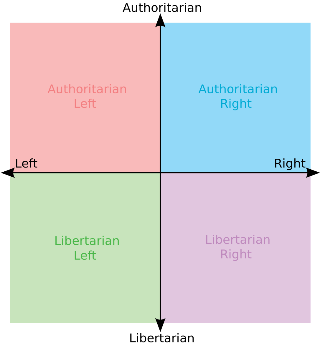
In this chart we can plot any political philosophy as having a score in two dimensions- authoritarian-ness and liberalism…-ness. Anyway you can plot a point on this like you would on any XY axis.
This chart actually shows a common theme amongst political spectra (that I’ve seen anyway): the idea that, in two dimensions, the political spectra range from liberal to conservative and authoritarian to libertarian. This makes sense intuitively, but it isn’t quite comprehensive. I feel that a more empirically justified spectrum is in order.
The Plan
Essentially, anyone’s political designation is some combination of their opinions of agreement or disagreement on various issues (gun control, taxes, etc…). If we can assign a numerical value to this, it means that we can represent it as a vector. If we get multiple people’s opinions together, we can make a matrix, and if we have a matrix, we can do PCA.
PCA (principal component analysis) is a way of reducing data to fewer dimensions. Essentially, it takes multidimensional data points and reduces the dimensionality from m dimensions to n dimensions, and it chooses the dimensions that best preserve the information given. Long story short, if I have data points in 300 dimensions, I can use PCA to find the best one or two dimensions that represent the data. It doesn’t have to be any of the original dimensions though. PCA can just find dimensions that it likes!
There are already websites that gives us all us presidential candidates positions on a set number of issues (abortion, gun control, etc) all ranked from “strongly disagree” to “strongly agree.” I took this data and vectorized it (-2 for “strongly disagree”, 2 for “strongly agree,” etc…). With this, I can do PCA. The website I’m using to get my data is here.
Also, for this experiment, I’m using the following not-too comprehensive list of candidates. I realize that a lot have dropped out by now, but more data is always better…
- Donald “make American’s hair great again” Trump
- Christ Christie
- Hillary Clinton
- Jebcito Bush: la tercera parte
- Mike Huckabee
- Rand Paul
- Rick Santorum
- Ernie “cutting the B.S.” Anders
- Ted Cruz
- Marco Rubio
For political issues, I was able to find all candidates issues on the following:
- abortion
- same sex marriage
- affirmative action
- presence of God in the public sphere
- limiting EPA restrictions
- easing voter registration
- strict punishment for crime
- second amendment rights
- expansion of Obamacare
- school voucher promotion
- prioritization of green energy
- marijuana as a gateway drug
- support of the 2008 stimulus
- higher taxes on the wealthy
- path to citizenship for illegal immigrants
- privatization of social security
- promotion of free trade
- expansion of the military
- belief in American exceptionalism
- aversion to foreign conflicts
The Results
To start off simply, we take the data and reduce it to one dimension. This, in principle, should place all the candidates on a single line. The results are as follows:
 Interestingly enough it seems like this almost perfectly matches the popular notion of the “liberal-conservative” spectrum with more conservative candidates, such as Santorum and Cruz, on one end and more liberal ones, like Clinton and Sanders, on the other. Note, however, that more conservative values were given lower values, and liberal ones were given higher ones. Because of this, the “right wing” is on the left, and vice versa.
The real surprises, however, come with a reduction to two dimensions. 
As before, we see conservative/liberal appear along the horizontal axis. The vertical one is a bit more perplexing. The fact that Rand Paul appears so distant from the others hints that the y axis may be authoritarian/libertarian (he certainly isn’t shy about how much he values personal freedom). If this was the case, it would make our spectrum the same as other graphs (which also have liberal/conservative and authoritarian/libertarian dimensions). It’s very possible that this representation doesn’t correspond to anything easily intuitive.
Whatever the interpretation may be, we can still gauge candidates against one another. We can measure the distance between candidates like we would measure the distance between any two points. Although in what way the two points are close or far from each other isn’t entirely clear, it still provides a way to measure who thinks like who in this election.

Would it be possible for you to release the dataset? It seems like it might be fun to play with.
LikeLike
certainly, the data I scraped from here http://presidential-candidates.insidegov.com/
LikeLike
I’d like to see the data. The results are certainly counter-intuitive.
LikeLike
in addition to the url provided above, the actual csv file I used can be found on my personal website (http://scarafoni.com/political_pca)
LikeLike
The second dimension in your second graph seems to be establishment/anti-establishment, which makes sense given the rhetoric of that election cycle. I also think your analysis is skewed a lot by including so many Republican primary candidates and only Democratic ones, though of course that’s determined by your framing.
LikeLike